Thursday, April 29, 2010

Painting Blood

Over the past couple of years, I've had a lot of questions about the way that I paint blood on weapons. I think that blood effects are something that almost everyone tries out at some point, but unfortunately a lot of people give up after a few tries.

I first started painting when I was eleven, and I first started painting blood on weapons almost immediately. The only trouble was that I was a terrible painter back then, so all of my minis looked like their axes and swords (and sometimes even guns) had been dipped in blood red paint. Which they were.

As I grew as a painter, I also grew out of the stage in my life where I wanted to throw tons of blood on everything. And since I wasn't having any luck with blood effects, I gave up on it.

A few years ago, I decided to give blood another chance. This time, I approached it as a multi-layered effect to add onto the weapon underneath. Here's my method:

First, start with bright '70's movie blood colored paint (that's Blood Red for fans of Citadel's line, and Khador Red Base for those who use P3). Mix it with black. You want this first mix to be almost totally black in color- more or less the color of a scab. Apply this to the edge of your weapon. This will end up being a layer of more dried blood.

From there, mix a little more red into your dark color, add a little bit of water and paint outward from the edge of the weapon.

You will mostly want to continue to do this, adding in more layers- and each layer gets closer to using pure red, while also getting thinner and also covering just a little bit more of the weapon.

After you have a pretty strong blood coloring on the weapon, you still aren't finished. You need to make it look wet. If you're going to seal your minis, make sure you do it before this step.

The last step is to apply Tamaya Clear Red over all of the areas you've painted with blood- and don't worry if you go just a little bit over the edge. Tamaya is just the perfect color to tint some of the darker shades and make the whole area look very fresh and gory.


Wednesday, April 28, 2010


Just thought I'd share a little bit of small press miniatures new with you.

Smartmax- a company that does some wonderful and original Victorian Horror miniatures has given us a preview of their upcoming Jaybee the Ripper mini.

By the way, most of their stuff is that creepy- and the stuff that isn't is an awesome cross between steampunk and World War I science fiction.


On another note, Scibor is releasing a strong addition to their "Celtic SciFi" range. I think it goes without saying that this mini would make a great Space Marine captain to the right chapter. Space Wolves come to mind.


Thursday, April 22, 2010

I recently painted up a third set of Space Hulk miniatures. I've now painted three sets of Terminators, and Two full sets of Genestealers (and I still haven't done my own).

I've been playing Space Hulk quite a bit too, and I'm really excited to try out some of the older 1st edition supplements (Deathwing had rules for a Terminator Captain, and there are rules that I've found for playing groups of Power Armored marines and even Imperial Guard).

Anyway, here are the latest set of painted miniatures:


Monday, April 19, 2010

Garden Ninja email is down

The Garden Ninja store is currently having some problems, and the email function is not working correctly.

If you have emailed me any time in the past ten days and I have not answered, please email me directly. You can reach me through email at:

drew at mediawonder.com

I'm very sorry for any problems this has caused.


Thursday, April 15, 2010


Wyrd Miniatures has just posted up their April releases for Malifaux. And they've kept up their hard work, and are once more offering us some of the creepiest miniatures in the business.

The new releases are:

Enslaved Nephilim
Doppelganger
Hollow Waif
Malifaux Child

I haven't played Malifaux, so I can't really recommend the game, but if put even half the work into their rules set as they do into their miniatures, it's got to be terrific.

Wednesday, April 14, 2010

Battle Damage


It was pointed out to me recently that I've never made a post talking about how I paint battle damage. Damage is a multi-stepped process, but there are a lot of places for you to make choices.

First off, you have to choose where to put damage on your mini, and what kind of pattern to follow. You are looking for that zen combination of realistic looking effects, and what will support your mini's composition. For realism, the areas that are most susceptible to damage are the hard edges of the mini. Any edge of metal plates are more likely to get scuffed. Also, there is more likely going to be some damage on the lower parts of the mini (near tank treads or feet) as these areas are likely to get worn and scuffed on rocks and terrain.

Beyond that, however, it is usually good to have some damage in other areas too. This can help your composition quite a bit, and is easily justified on war machines and trooper armor.


I almost always start out by painting up the areas I want damaged in black. This allows for two things- first off, it suggests that the damaged armor was painted using a primer, and that it is showing through a little in the damaged areas. It also gives you some strong black-lining for the damaged areas themselves- and the black lining helps the battle damage to "pop."

I sometimes use a small sponge of a piece of foam to apply the black. This allows for a very scattered and random pattern for the damage to follow, which helps the damage look more realistic.


The second step I usually take is to put on a background metal for the damage itself. I find that using a little bit of a darker bronze-ish color is best for this. Good examples include Citadel Tin Bits, P3 Brazen Brass or almost any bronze color mixed with P3 Brown Ink. This will give you a good background for your silver damage- it helps to make the areas look more worn, slightly rusty without going too far.

By the next step, you are ready to apply some silver to your areas. You'll want to thin your paint down a little, so that the bronze color underneath can show through. If you have large enough areas, you might want to consider layering up from darker silvers up to lighter ones. Another option is to mix some of your base bronze with your silver as you layer up.

I often go all the way up to Citadel Mithril Silver for the damage. The bright silver gives the area a more scratched up look while at the same time pushing the silver forward for composition reasons.

Now you could be finished here, but you don't have to be. I often apply thin brown or blue washes over minis that are battle damaged- making them look either worn or dirty. If you are applying any washes like this, then make sure to get the damaged areas. A wash can add a nice touch to your damaged armor.


One last note on metal rivets. If I want rivets to stand out as metallic pieces, I usually paint them up using the same methods mentioned above- often I leave out the black. Painting rivets like this makes them look like worn raw metal- and they should match your battle damage well.


Thursday, April 8, 2010

Privateer Press is hiring

Privateer Press is hiring a new coordinator for events and competitions. It seems that they need someone to be the tournament organizer throughout the convention circuit (and possibly to design some tournament scenarios).

For those of you less in the loop, Privateer Press is a Seattle based company and their headline game, Warmachine, is a rather competitive table top minis game.

Anyway, for anyone insterested in working in the industry, you could do quite a bit worse than Privateer Press.

Monday, April 5, 2010

Painting Miniatures in Pink

There is something ironic about using pink on miniatures altogether. I've seen quite a few pink minis in my time, the first ones were a force of pink space marines (the Posy chapter).

Most of the time, the pink is meant as a joke, or possibly a way to trash talk your opponents further (for example, "you just lost to a bunch of pink Posies").

At the same time, there is something else that calls to painters. Maybe it is the fact that we've all had a paint pot of tentacle pink sitting unused among the other paints for the past decade or two, but there is a call to use pink- and to make it appropriate. It might just be the way we're all ready to be the one to say, "Hey, I can even make this look good."

The commissar here is something more like that. She wears a light magenta rather than the red that her fellows wear, and overall, I think it works as pink (without shouting "I'm pink")


The Noise Marines above are an interesting case. The Games Workshop studio color scheme for these guys is bright pink with some black. I'm almost certain it was because someone wanted to pull out their pot of Tentacle Pink and figured he'd never have a better chance than with Slaaneshi chaos marines. Of course, at that point, the objective is to make the color schemes shout out "I'm so pink!"

The last example I'd like to show is something at once more subtle and more brazen than the other two. This is an Iron Kingdoms Infernal Curator. Essentially that means that they're the kind of demons that make deals for souls.

The pink light sourcing made him use almost the exact color pallet as the noise marines, but the light source touching everything makes for a lot of darker pinks, which in turn make the whole mini look lit in pink light, and not necessarily all dressed in bright hues.


Monday, March 29, 2010


I always love to go and check out some of Reaper's preview pages. They always have some fine miniatures to look at and anticipate. And ever since they started up their Chronoscope line, you really have no idea what to expect from them, from warcasters to biker girls to pregnant orcs.


Also, Jason Weib's idol is something I wasn't expecting to see:


The real problem is that they aren't available just yet, so I'm always a little disappointed that I can't paint any of them right now.

Tuesday, March 23, 2010

Hordes Minion book official


Many are still wondering exactly what the switch to faction specific books will do to Warmachine and Hordes. One part of the puzzle that hasn't landed yet is what will become of the Hordes Minions who aren't associated with any faction?

As part of a hint heavy episode of Privateer Press' "Insider," Jason Soles announced that he has been working hard on some new additions to the Minions Faction Book.

What could be in a Minions faction book? It might make Minions into a playable faction- in the same way that Mercenaries became a faction with Escalation.

Mind, that was an accident. Privateer Press spent a year telling people that Mercenaries were not a faction before creating more detailed rule in No Quarter #1.

While I'm sure that Privateer Press staffers want to avoid that trouble a second time, I think they also have been pretty open to adding new factions deliberately. The first two forces books we saw were the Pirates of the Broken Coast and the Retribution of Scyrah.

Some of my friends have taken the way that the new Hordes PDF cards for the minion warlocks to mean that there will be more Gatorman and Farrow warbeasts. There could be a lot more than that going on too.

So, will Minions become a faction of their own? Or will they simply add enough new minions to the existing ranks to fill out an entire book?

Friday, March 19, 2010

Painting Hotrod Flame Designs


Painting freehand is a great way of adding some character to open spaces on minis. There are a lot of different and specific ways to paint freehand on a mini, so today I want to talk about painting hot-rod flames.

The first step is to get the outline of the flames right. I usually start out by painting the flames in white. As with all freehand, the simplest way to get the shapes right is to start out getting them close, then doing some clean up with the base color underneath.

Fire should always be brightest at its source, and get darker as it licks away from it, but for a hotrod flame you don't have to follow that rule. Since these flames are meant to look like designs or decals, they don't need to look like actual flames at all.

So, the next step I normally take is to take a strong red color and apply it to the base of every one of the flames. This is an ugly stage for the mini- it will be bright white with a stark red at the bottom.

The way to bring this all together is to apply a yellow ink or wash over the flame area. it will turn the red a little bit orange and start to bring the colors to a good medium.

Sometimes, that is where I leave it. Often the blend between the red and yellow doesn't need any more work. At other times, however, there needs to be an intermediate color.

I find it is easiest to do this is you work while the yellow ink is still wet. Take an orange (or a mix of red and yellow) and apply it over the area in between the two colors. If you do this while the ink is still wet, it will start to blend into the other colors with little effort (you can wet blend the two together, or just leave it and let it blend a little on its own).

Overall, this is a great way to break up the composition on large areas of a mini, or add some character to your veterans.


Thursday, March 18, 2010

Ogryns

One of the things that I like painting the most are faces. I've already done a couple posts about painting human faces (separate ones for male faces or female ones and a third one just about eyes).

A lot of those techniques apply to fantasy and science fiction races also (and many can be applied for striking effect). Often, you have to look at the mini and decide whether using all of those techniques is right for it, or if you should only use some of them (or even none of them).

One race that seems fairly prevalent among miniatures is ogres. And the wonderful thing about ogre minis is that you can usually use every one of your human face techniques on them and the only difference is that you have more area to work with.

As an example, here are some Warhammer 40,000 Ogryn that I painted recently. The faces on these minis were very well sculpted, and I had a great time painting them up.

All of the normal human face details- 5 o'clock shadow and shaved head shadow, red under the eyes etc. -all add quite a bit of depth to these expressive faces.


Wednesday, March 17, 2010

As I mentioned before, I recently finished a commission for some Salamanders. I actually did two Land Raider Redeemers for the project- and I did my best to make them both match and each be unique.

The freehand especially is quite a bit different between the two. But anyway, here are some pictures:


Monday, March 15, 2010

I recently finished a commission for a full force of Salamander Space Marines, and I ended up with enough photos to start new Salamanders gallery.

First, though, I wanted to post just one of the land raiders- with a lot of close up shots. There was a good amount of free-hand and hazard striping that went into this mini, and I really wanted to share that.


Friday, March 12, 2010

Due to some popular demand, I have taken a photo of the free hand work I did on the Librarian's shoulder pad.

I thought that a female angelic figure would work pretty well as a Blood Angel decoration. Overall, the design was inspired by some freehand work Jen Haley did on a shoulder pad for the Emperor's Champion.

Mine isn't quite as detailed as Haley's, but it has the same basic structure to it.


Tuesday, March 9, 2010

Space Hulk Librarian

Here's something I finished recently: the librarian from Space Hulk. I've painted a few sets of Space Hulk minis, and eventually got my own copy of the game.

By the way, the game is actually a little better than I remember it from way back when. The new edition is pretty much the original game plus Deathwing, and a few tidbits here and there. I'm actually on the lookout for Genestealer and the old Space Hulk Compendium- it has rules for putting most 40k factions onto a drifting space hulk.

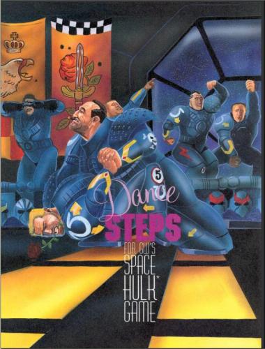
I already found the old rules for dancing space marines. I mean, If that level of obscurity is still to be found, I'm sure that the rest is somewhere.

So here is the first of my Space Hulk set painted. It will take me a while to get around to all of the others- really, I just have a lot to paint these days.


For those of you who are interested, I wasn't kidding about the dancing space marines. They were featured in an old issue of Dragon Magazine- from back when it wasn't run by Wizards of the Coast.

Honestly, I think both the concept and the artwork was Paranoia inspired.

Boy, those Ultramarines kick up a rug.

Thursday, March 4, 2010

Bright Colors on Imperial Guard


I've been doing some imperial guard commissions lately- a lot of them are for a Praetorian force.

The strange thing about the Praetorian and Mordian regiments is that they don't look like other Imperial Guardsmen at all. Rather than wear the drab colors and camo patterns- inspired largely uniforms from both world wars and Rambo films, the Praetorians and Mordians wear dress uniforms to battle, with bright colors boldly displayed.

This shouldn't feel at all out of place in a universe where the Emperor's finest can call themselves "Rainbow Warriors" and be acceptable.

But despite the Grim Dark future being so populated with bright oranges and reds, it seems a little odd to paint the World War II inspired tank designs of the imperial guard that way. It is sometimes hard to imagine Imperial Guard vehicles in flashy coloring.

Of course, when they're painted, Guard vehicles look really good in the bright colors.