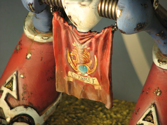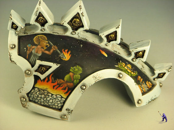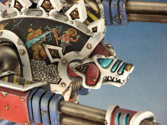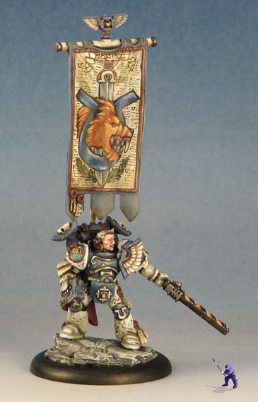
A few times, I have been asked to share my methods for painting the more detailed freehand coat of arms and murals.
The first thing to do in every instance is to break the shape you want down into basic shapes- the ones you learned about in elementary school (like circles, ovals, rectangles, triangles etc).
For example, a skull can be created out of a semi-circle on top, with circles for eyes and a squat trapazoid where the teeth attach.

You can actually break up pretty much any image into these kinds of shapes. It is sometimes best to use references at this stage. For example, when I first started painting lions, I actually took a good long look at the Lionhead Studios' lion to figure out how to create my freehand:

So, after you have a basic idea of the shapes that make up your freehand, paint on an outline in your darkest colors. Shading on a flat surface is a lot more difficult than simply highlighting up, so I always start freehand with some of the darker colors.

Highlighting is an odd process here. Basically, I fall back onto what I know of miniatures, and imagine where I would highlight the insignia if it were a three dimensional mini. For example, on a face, I would highlight up to the brow, cheekbones, and leave darkened areas in places like below the lips.

I tend to work with one color at a time, and then move onto the next one by starting over with basic shapes again. For example, I first painted the outline of these characters, then painted each color separately, adding details like teeth and eyes after the rest of the faces were completed:

One last note- depending on the look you are going for, it is often best to go back in and add dark lining to the freehand that you've finished. Dark lines help different areas pop- especially from a distance. From my examples, you will notice that I often add lining in this way, but not always. Just be aware that lines that are very dark can add a sort of cartoony/comic book look to a miniature.

It is often good to fall back on some basic freehand designs that you may have used in the past. I use the same methods for jewels, flames, lightning, or starscapes as part of complex murals as I do when I'm painting them as simpler effects. I've even used quite a bit of Object Source Lighting techniques to add some zest to the freehand.
That's pretty much it. Like all techniques, the more you push yourself to stretch, the better you'll get at it.


No comments:
Post a Comment